
Describing
Graph /Chart
|
Describing
Graph /Chart |
1.The graph below shows the gradual increasing rate of the Internet
users in Bangladesh.Describe the graph in at least 80 words. You should
highlight the information and report themain features given in the graph.

Gradual Increasing Rate
of the Internet Users in Bangladesh
The bar graph displays the number of the
Internet users from the period 2000 to 2012. Thechart shows that during these
13 years the number of the Internet users is increasing rapidly. In2000, only
0.31 crore of people used the Internet whereas in 2002 it rose to 1.5 crore in
number. Thisnumber is about 5 times more than that of 2000. The number of the
Internet users rose to2.43 crore in 2003 that is remarkable. In 2005, the
number of the Internet users reached 3 crore andin 2007 it reached 5 crore. So,
we notice the greatest increase in the number of the Internet usersbetween2005
and 2007 and it is 2 crore. In 2009, 5.56 crore of people used the Internet
which roseto 6.14 crore in 2012. From the graph, it is seen that the tendency
of using the Internet is graduallyincreasing undoubtedly to keep pace with the
demand of the modem age.
2.The graph below shows "The number of people living below the poverty line from 1995 to2010". Describe the graph in 150 words. You should highlight and summarize the informationgiven in the graph.

The Number of People
Living Below the Poverty Line
The bar graph shows the number of people
living below the poverty line from 1995 to 2010.From the graph we notice that
in 1995, population below the poverty line was 35%. Unfortunately,population
below the poverty line in 2004 became 44%. But, this rate sharply decreased to
11.5% innext four years, and it came down to 32.5% in 2008. This rate further
decreased and it was 28.5% in2010. From 1995 to 2010, during these 15 years a
struggle against poverty was noticeable thoughcompared to the long period, this
result was not up to the mark. From the survey, we notice that in1995,
population below the poverty line was 35% and in 2010, it came down to 28.5%.
During theselong 15 years the number of people living below the poverty line
decreased to only 6.5%. Therefore govt.
should look into the matter and take effective moves to root out poverty from
our country.
3.The pie chart below shows the time allocation of students' daily
activities. Analyze the chart focusing the main preoccupations. (At least in 80
words.)

Time Allocation of
Students' Daily Activities
The pie chart shows how students pass their
time doing various activities. The chart shows that more than half of students'
time is spent in school and in sleep. The rest of the time is spent in play,
study, recreation and other activities, students pass 30% of their time in
sleep and 25% of their time in school. Thus they spend more time in these two
activities. Playing games is important to them, and so they spend some time in
play. They keep 5% of their time for this. Students also give importance in
recreation. They pass 12% of their time in recreation. The students pass 5% of
their time in play. Last of all, they spend 8% of their time in other
activities. Thus students pass their time in sleep, school, study, playing
games, entertainment and doing other activities. The ratio of students' time
spending indicates that they spend their time in a logical way.
4. The graph chart shows the choice of profession by educated people
in our country. Describe the graph in at least 80 words.

Choice Of Profession by
Educated People In Our Country
The mentioned column graph shows the choice
of profession by different educated people. The graph represents the typical
trend among the educated people who are the enlightened representatives of our
society. The study shows that the highest portion of educated people choose
govt. job as their profession or career. In percentage, 60 persons out of 100
have shown their preference for govt. job. Next comes banking which is the
choice of 42% educated persons as their profession. The third highest portion
of people have shown their like for teaching as their profession. And, 32% of
people like teaching. Next comes business which is the choice of 18% educated
people as their profession. Then comes farming, and only 10 percent of the
educated people choose farming as their profession. The rest and the lowest
portion of the educated people have been found to choose research work of
different types. Only 6% percent of educated people have shown their like for
research work as profession or career. From the graph it is found that most of
the educated people choose a job as their Profession, and a small portion of
educated people like self-employment and farming. But it is not hopeful. The
govt. should take effective steps to encourage educated people to engage in
farming as our is an agricultural country. Also, educated people should be
encouraged in business or self-employment.
5.The pie-chart below shows the percentage of a family's household income distributed into different categories. Describe the pie-chart in 150 words.
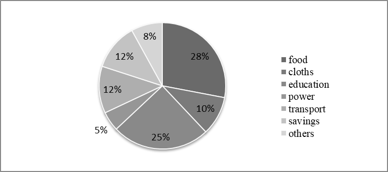
Percentage of a Family's
Household Income Distributed into Different Categories
The pie chart shows the distribution of
annual incomeof a particular family. The chart reveals that the highest portion
of the family income is spent on food and this is 28% of its total income. Then
comes the expenditure for education. The family spends 25% of its income for
education. The expenditure on clothes is 10%. Family's other expenditures are
5% for power and 12% for transport. The family spends 8% of its income on other
purposes. Besides, the family saves 12% of its total income. From an analytical
view we can say that the family is a middle class family as 28% of its income
is spent on food. The chart also reveals that this family is very conscious
about education. From the Chart it is also understood that the family realizes
the importance of savings and so it saves 12% of its income for future. In
fine, we can say that it is a very well planned family.
6.Look the chart below. It shows the sources of air pollution in a city. Now, analyze the chart in at least 80 words focusing the main aspects.
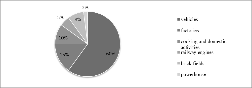
Sources of Air Pollution
in a City
The pie chart shows the pollutions of a city
by six different sources. The sources are the vehicles, factories, cooking and
domestic activities, railway engines, brick-fields and powerhouse. The highest
level of pollution is caused by different types of vehicles, and it cover 60%
of the total pollution. The second highest rate of pollution is caused by
factories and it cover 15% of the total pollution. The third source is the
cooking and domestic activities which cover 10% of the total pollution. Railway
engine sources also contribute to pollution which covers 5% of the total. Next
comes the rate of pollution caused by brick-fields and it covers 8% of the total.
And, powerhouses also contribute to pollution and it covers 2% of the total
pollution. From the chart it is clear that the highest level of pollution is
caused by vehicles and the lowest rate of pollution is caused by powerhouse.
Besides, factories, cooking and domestic activities and brick-fields are also
greatly responsible for pollution. The authority concerned should, look into
this matter so that the rate of pollution can be minimized to a great extent.
7.The chart below shows the benefits of girls'
education. Describe the chart in 150 words. You should high-light and summaries
the information given in the chart.

Benefits of Girls'
Education
Girls' education is very essential to
sustain the development of any country. A country may be developed with the
participation of all the people of all classes irrespective of sex or gender in
the national production, so the women of a nation are badly needed to work. But
if these women are not educated, they hardly can do much for the nation.
Education shows them the way to improve their
health and fulfil their necessity of nutrition. When a girl is educated, she
herself learns how to reduce population growth. When girls contribute to family
income, this contribution as a whole has its own share in the national economic
productivity that can smoothly pave national development. If girls are
educated, the whole nation will be educated. A nation needs educated population
to sustain its development.
So in a nut-shell, we can say that girls’
education can help to sustain the stream of development of a country or nation.
8.Look at the following graph. It shows a comparative selling rates of four types of book in Ekushey Boi Mela 2019. Now describe/analyze the graph in your own words.

Comparative Selling Rates
of Four Types of Book in Ekushey Boi Mela
The bar graph shows a comparative selling
rates of four types of books in Ekushey Boi Mela-2019. The graph shows that the
categories of books are- Science Fiction, Novel, History and Poetry. According
to the chart, the highest selling books are novels. About 4500 novels are sold
in this Ekushey Boi Mela-2019. Next comes the science fiction category which is
the second highest selling category of books. The chart shows that nearly 3000
books on science fiction have been sold in this Boi Mela. According to the given
chart, books on history are the third highest rated in regard of selling.
Near about 2200 books of this category have been sold in this mela. If we look
into the selling rate of poetry, it will be apparent to us that this is the
lowest selling category. The number of books sold in this category is below a
thousand. So it can be remarked that according to the chart the popularity of
novel is the highest, the second is science fiction, the third is history and the
fourth is poetry in regard of selling rates.
9.The graph below shows the literacy rate of Bangladesh in different years from 1995-2010. Now, describe the chart in 150 words. You should highlight and summarize the information given in the chart.

Literacy
Rate of Bangladesh in Different Years
The
graph shows the fluctuation of the literacy rate of Bangladesh in some
selective years since 1995. The graph reveals that the literacy rate of
Bangladesh since 1995 fluctuates from 38.1% to 56.8%. In 1995 the rate was only
38.1% but in 2000, it rose up to 56% (within 5 years). But in the next year
(2000 to 2001) the literacy rate of our country was on the wane. In 2001 the
rate came down to 47.9% which was 8.1% less than the previous survey. The next
two years (2001-2003) was the last segment of decreasing of literacy rate in
Bangladesh. In those two years, the rate reduced by 4.8% declining the rate to
43.1% only. It is the last indicator with negative impression. But if we look
at the last indicator in 2010, we can find a positive change. In this seven
years (2003-2010), the literacy rate of Bangladesh got a significant increase
of 13.7%. And in 2010 the literacy rate came up to 56.8% which is the highest
rate indicated in the graph. It is also significant that from 1995 to 2010 (in
15 years) the literacy rate of Bangladesh rises 18.7% in total.
10.The graph below shows 'Candidates in SSC Examination-2019 in Chittagong and Comilla Board'. Describe the graph in 150 word should highlight and summarize the information given in the graph.

Candidates in SSC
Examination-2019
The graph shows that the number of male and
female students sitting for the S.S.C examination in the year 2019 is 326949
from three different groups- Science, Humanities and Business Studies. At first
glance, the chart shows that the highest number of candidates are from Business
Studies group, and the lowest number of candidates are from Science group. From
Business Studies a total of 153376 candidates sit for the exam out of which
85364 candidates are males and 68012 are females. This is the highest number of
boys and girls from a single group. The lowest number of boys and girls sitting
for the exam are from Science Group. Here the males are 43281 and the females
are 32546. Clearly, in number of candidates, Humanities Group occupies the mid
position. From this group a total of 97746 candidates sit for the exam out of
which 34219 are male candidates and 63527 are the females. From the chart it is
also clear that the highest of female students are from the Humanities group,
and the highest number of male students are from Business Studies Group. The
lowest number of female students. However, are from Science Group, and and the
lowest number of male students are from Humanities Group.
11. Look at the following graph. It shows different types of pastime
activities of the students of Bangladesh from 1990 to 2010. Now, describe the
graph.

Pastime Activities of the Students of Bangladesh
There is a
significant change in students' trends towards pastime activities. A recent
survey shows that during the last twenty years, teenagers have undergone
significant changes in choosing their pastimes. The survey results are
presented through a graph which shows that there is a steady rise in young
people’s tendency of watching TV. In 1990, 40% of teenagers liked watching TV
which increased to 48% in the next ten years and it further increased 55% in
the next decade. Unfortunately, the picture is grim in terms of students'
attraction to open field games and sports. While 50% of youngsters opted for
games and sports in the 90s, 10% withdrew themselves from these after a decade
making it 40%. Unfortunately the falling tendency persisted on during the next
ten years and by 2010 it came dawn to 30%. Though the young people have
dissociated themselves noticeably from games and sports, there is a sharp and
solid increase in their association with online or computer assisted
programmes. In 1990 the users of online or computer for pastimes were only 10%.
but in 2000 the number reached 15% with a rapid increase in the next ten years
when it when up to 25.
12.The bar chart below shows young people's changing attitude to
pastimes. Describe the chart in. I50 words. You should highlight and summaries
the information given in the chart.

Young People's Changing
Attitude to Pastimes
There
is change in people’s trends towards favourite pastimes. A recent survey shows
that during the last twenty years, teenagers have gone through significant
changes in choosing their pastimes. The survey results are presented through a
graph which shows that there is a steady rise in young people’s tendency to
watch TV. In 1990, 41% of teenagers liked watching TV which increased to 48% in
the next ten years and it further increased to 52% in the next decade.
Unfortunately, the picture is grim in terms of young people’s attraction to
open field games and sports. When 50% of youngsters opted for games and sports
in the 90s, 12% withdrew themselves from it after a decade making it 38%.
Unfortunately the falling tendency persisted on during the next ten years and
by 2010 it came to 25%. Though the young people have dissociated themselves
noticeably from games and sports, there is a sharp and solid increase in their
association with online or computer assisted programmes. In 1990 when the users
of online or computer for pastimes were only 9%, in 2000 the number nearly
doubled and reached 14 with a rapid increase in the next ten years when it shot
up to 23%. The survey also explains the reasons for this change. It says that
television has become a part of everyday life even to the underprivileged
section of people. This results in young people’s choice for watching TV as one
of the most favorite pastimes. The increasing urbanization has reduced the
number of open fields. Therefore, there is a fall in selecting games and sports
as favourite pastimes, though it’s not any good news for the country. And the
reason of selecting the computer assisted or online programmes is that computer technology is
getting cheaper, easier, and more popular every day. Indeed our young
generations are stepping to an e-world.
13.The graph below shows the results of SSC examination of ABC Secondary School from 2010 to 2014. Describe the graph in 150 words. You should highlight and summaries the information given in the graph.
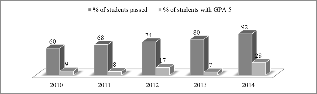
Results of SSC
Examination of ABC Secondary School
The graph shows the results of SSC examinations of ABC Secondary School from 2010 to 2014. In general, the graph shows a gradual improvement of the SSC candidate's performance within this time. It is seen from the graph that the pass rate increased from 60% in 2010 to 92% in 2014. The graph also shows an increase of candidates who passed with a GPA-5 except in 2013. In fact, the school had the lowest rate of GPA-5 holders in 2013 which was only 7%. The performances of the SSC candidates were almost similar in 2011 arid 2012, with slightly better results in 2012. The school recorded the best results in 2014 when the pass rate went beyond the 90% mark. Moreover, a record of 28% candidate passed with a GPA 5 in this year. Overall, the graph illustrates that the SSC results of ABC Secondary School is improving steadily.
14.The graph shows yearly Imports and Exports (Billion dollar) of Bangladesh. Describe it in short and you should highlight and summarize the information given in the graph.

Yearly Imports and
Exports (Billion dollar) of Bangladesh
The bar graph shows the yearly amounts of
import and export. Here imports and exports of the year 2009 to 2011 have been
shown through two comparative columns. In the graph it is noticed that in the
year 2009 the import has been figured as 15.07 and the export as 19.76. In the
year 2010, the export is shown to be 16.24 billion dollars and import is 21.34
billion dollars. In the last year, export stands at 23.86 and import at 31.75
billion dollars. So, the trend of imports .and exports, as shown in the graph,
is on the rise. But it, at the same time, presents rather a frustrating picture
of our economy. Because, in spite of our export and import increasing
proportionately, our export could not surpass the import. So, the authority
concern should be up and doing to increase the exports of the country.
No comments:
Post a Comment